
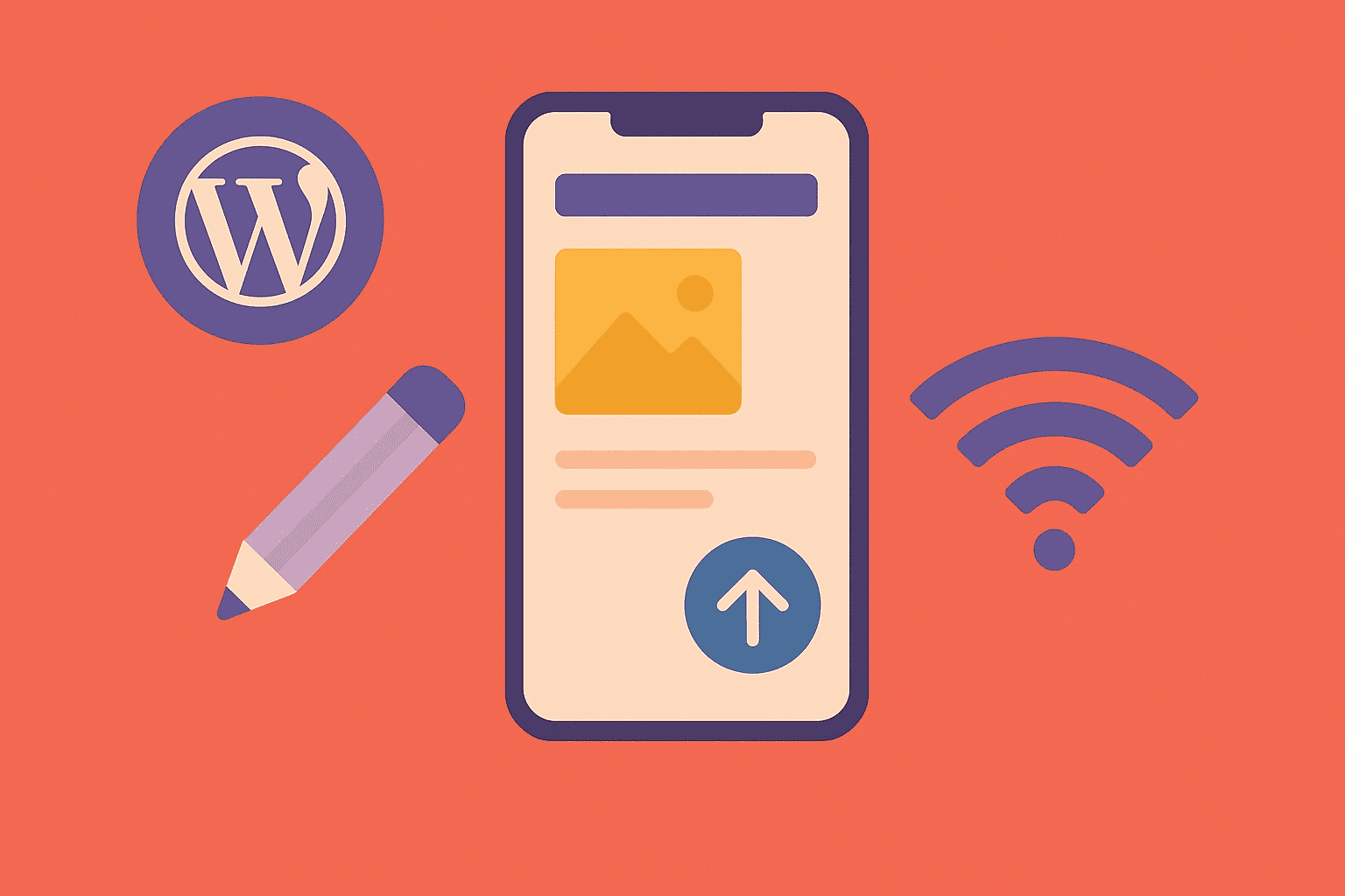
Introduction
The internet is mobile-first. By 2025, over 70% of web traffic comes from mobile devices. For many industries (e-commerce, travel, food delivery), that number is closer to 85%. If your WordPress site doesn’t perform well on mobile, you’re losing visitors, sales, and Google rankings.
Google has also adopted mobile-first indexing, meaning it primarily looks at your mobile site to determine search rankings. That makes mobile-first design not just a UX priority but also an SEO requirement.
This article explores how to design, build, and optimize mobile-first WordPress websites in 2025.
1. What Is Mobile-First Design?
Mobile-first design means creating websites with the mobile experience as the foundation, not an afterthought. Instead of designing for desktops and “shrinking it down,” mobile-first flips the process:
- Start with small screens, prioritize essentials.
- Scale up gracefully for tablets and desktops.
💡 Key Difference: Responsive design adjusts layouts across devices, while mobile-first ensures mobile is the priority.
2. Why Mobile-First Design Is Critical in 2025
- User Behavior: Most users shop, read, and browse on phones.
- Conversions: Mobile-friendly sites convert more visitors into customers.
- SEO: Google’s mobile-first indexing directly affects rankings.
- Accessibility: Mobile-first design often improves usability for all.
💡 Fact: A 2024 Shopify study found that stores with optimized mobile checkout had 30% higher conversion rates.
3. Choosing a Mobile-First WordPress Theme
Not all WordPress themes are equal. In 2025, the best mobile-first themes are lightweight, responsive, and block-editor-friendly.
- Astra: Minimal, highly customizable.
- GeneratePress: Fast and mobile-optimized.
- Kadence: Flexible with responsive controls.
- Blocksy: Gutenberg-first with mobile UX in mind.
When evaluating themes:
- Test demo sites on mobile.
- Look for responsive menu design.
- Check compatibility with WooCommerce mobile checkout.
4. Mobile-Friendly Navigation
Navigation is often the hardest part of mobile UX.
- Use hamburger menus or bottom sticky navs for thumb reach.
- Keep menus short—prioritize essential links.
- Add search functionality for quick access.
- Use collapsible filters for WooCommerce product pages.
💡 Example: A clothing store that switched to a sticky bottom nav bar saw a 15% increase in add-to-cart actions on mobile.
5. Optimize Mobile Performance
Speed is more important on mobile due to slower networks.
- Use caching plugins (LiteSpeed Cache, WP Rocket).
- Compress images into WebP/AVIF.
- Enable lazy loading for images and iframes.
- Use a CDN to serve assets globally.
- Minimize plugins and scripts.
💡 Mobile Core Web Vitals should be your benchmark:
- LCP < 2.5s
- CLS < 0.1
- INP < 200ms
6. Mobile-Optimized Content Layouts
Content must be scannable on small screens.
- Use short paragraphs (2–3 sentences).
- Break content with headings and bullet lists.
- Keep CTAs large and thumb-friendly.
- Use responsive typography (16px+ base font).
💡 Pro Tip: Test with Google’s Mobile-Friendly Test to catch text too small to read.
7. Designing Mobile-Friendly Forms and Checkout
Forms and checkout flows are conversion killers on mobile if not optimized.
- Limit fields to essentials.
- Use auto-fill and input masks for phone, email, credit cards.
- Provide digital wallet payments (Apple Pay, Google Pay, UPI).
- Add progress indicators for multi-step forms.
💡 WooCommerce checkout optimization plugins (CartFlows, CheckoutWC) improve conversions significantly on mobile.
8. Accessibility in Mobile-First Design
Accessible mobile design improves UX for everyone.
- Ensure high-contrast colors.
- Provide touch-friendly tap targets (44px min).
- Add alt text for images.
- Enable keyboard navigation for accessibility devices.
9. Testing Mobile UX Effectively
Testing is crucial to validate your design decisions.
- Use tools like Google Mobile-Friendly Test and Lighthouse.
- Test on real devices (iOS + Android, different screen sizes).
- Use emulators in Chrome DevTools for quick checks.
- Gather user feedback on mobile experience.
💡 Pro Tip: Track mobile vs desktop conversion rates in Google Analytics 4. If mobile lags, you need UX fixes.
10. Future of Mobile WordPress Design
What’s next for mobile-first design?
- AI-powered adaptive layouts: Content adjusts automatically based on user behavior.
- Voice-enabled navigation: Growing with smart devices.
- PWAs (Progressive Web Apps): WordPress sites behaving like apps.
- Gesture-based navigation: Swipe-friendly UIs for mobile WooCommerce.
Final Thoughts
Mobile-first design isn’t optional in 2025—it’s the foundation of success. A WordPress site that looks beautiful on desktop but fails on mobile won’t rank, won’t convert, and won’t build trust.
The formula is clear:
- Start with mobile-first themes.
- Optimize navigation, content, and checkout for small screens.
- Prioritize speed, accessibility, and usability.
💡 Action Step: Load your WordPress site on your phone right now. Does it feel fast, intuitive, and conversion-friendly? If not, it’s time to embrace mobile-first design fully.


")


")


")